The traditional Chinese color palette is one of the world's oldest and most sophisticated color systems, with a history spanning over three thousand years. Unlike the modern Western color system, which is based on the physics of light and the biology of vision, the Chinese color system is rooted in philosophy, cosmology, and cultural symbolism. The traditional Chinese palette includes five primary colors — red, yellow, blue-green, white, and black — corresponding to the Five Elements (五行, wu xing) of fire, earth, wood, metal, and water.
The Five Colors
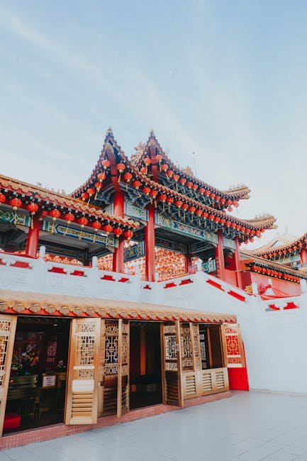
Red (红色, hong se) is the most powerful and auspicious color in Chinese culture. Associated with the element of fire, the direction south, and the season of summer, red symbolizes good fortune, joy, and prosperity. It is the color of festivals (especially Chinese New Year), weddings, and celebrations. In architecture, red is used for columns, beams, doors, and window frames, particularly in imperial and religious buildings. The deep red lacquer (朱漆, zhu qi) used on furniture and architectural elements is one of the most iconic colors of Chinese design.
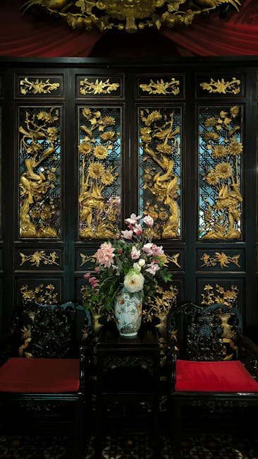
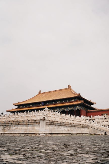
Yellow (黄色, huang se) is the color of the earth element, associated with the center and imperial authority. During the Ming and Qing dynasties, yellow was reserved exclusively for the emperor — yellow glazed tiles covered the roofs of the Forbidden City, and yellow silk robes were the emperor's exclusive attire. In interior design, yellow appears in gold leaf decoration, imperial brocades, and the amber tones of aged nanmu wood. The color conveys warmth, richness, and authority.
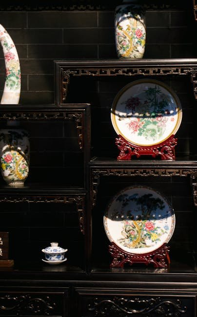
Blue-green (青色, qing se) is the color of the wood element, associated with the east and spring. It encompasses a range of hues from pale celadon to deep cobalt blue. Blue-green appears in architecture as the color of ceramic roof ornaments and painted beam decorations. In interiors, it is found in celadon ceramics, blue-and-white porcelain, and the subtle glazes of Jun ware. The color evokes growth, harmony, and the freshness of spring.
"The Chinese color system is not primarily about visual perception but about cosmic harmony. Each color corresponds to an element, a direction, a season, and a virtue. Using color correctly means aligning a building or an interior with the fundamental forces of the universe. This is color as cosmic ordering principle, not color as mere decoration."
Color in Architecture
The use of color in traditional Chinese architecture is governed by sumptuary laws that regulate who may use which colors and in what contexts. The most important buildings use the full palette of five colors, with red columns, yellow roofs, blue-green beams, white marble platforms, and black painted details. Lower-status buildings use fewer colors, with grey roofs, white or grey walls, and wooden columns left in their natural color. These color regulations made the social hierarchy visible at a glance, with the most colorful buildings being the most important.
In interior design, the Chinese color palette offers a rich vocabulary for creating different moods and atmospheres. A formal reception room might use the classic combination of red and gold, evoking warmth and splendor. A scholar's study might use more restrained colors — celadon green, soft white, and the warm brown of rosewood — creating an atmosphere of calm concentration. A tea room might use earthy tones — brown, beige, and green — that connect the interior to nature and promote relaxation.
Contemporary Applications
Contemporary Chinese designers are reinterpreting the traditional color palette for modern interiors. The key is to use the traditional colors thoughtfully rather than literally — a New Chinese Style interior might use celadon green as an accent wall color rather than covering the room in traditional patterns, or use the red-gold combination in a single statement piece rather than throughout the room. The goal is to evoke the richness of Chinese color tradition without creating a space that feels like a historical reproduction.
For homeowners interested in incorporating Chinese colors into their interiors, a good starting point is to choose one or two colors from the traditional palette and use them as accents against a neutral background. A celadon vase on a white shelf, a red lacquer console table against a pale wall, or a blue-and-white porcelain collection displayed on a dark wood cabinet can add a touch of Chinese color sensibility to any interior without overwhelming the space. The key is to follow the Chinese principle of restraint — let each color have room to breathe.
Beyond the five-element color system, Chinese architectural polychromy developed sophisticated technical traditions for preparing and applying pigments. Traditional mineral pigments — azurite for blue, malachite for green, cinnabar for red, orpiment for yellow — were ground by hand, mixed with animal glue as a binder, and applied in multiple thin layers over a base coat of lime or tung oil. This painstaking process produced colors of extraordinary depth and durability. The painted beams of the Forbidden City's imperial halls retain vivid color after more than two centuries of exposure to Beijing's harsh climate, a testament to the technical mastery underlying Chinese color practice. Modern conservation workshops in Beijing and Suzhou continue to train specialists in these traditional pigment preparation and application techniques, ensuring that the knowledge required to maintain China's polychrome architectural heritage is not lost.
For contemporary interiors, the Chinese color palette offers more than decorative inspiration — it provides a framework for thinking about how color shapes spatial experience. The Chinese principle that each color carries associations beyond the visual aligns with modern color psychology research demonstrating the measurable effects of color on mood, cognitive performance, and perceived spatial qualities. By approaching color as a design tool with both aesthetic and psychological dimensions, the Chinese tradition offers insights that remain relevant to interior designers working in any cultural context.
The production techniques behind traditional Chinese pigments represent a sophisticated material science developed centuries before modern chemistry. The most prized red pigment, derived from cinnabar (mercuric sulfide), was mined primarily in Guizhou province and processed through a complex sequence of grinding, washing, and levigation to produce particles of precisely controlled size and color intensity. The blue used on the Forbidden City's roof ornaments came from cobalt ore imported via the Silk Road from Persia, ground to an almost molecular fineness. Scientific analysis of surviving Tang and Song dynasty architectural polychromy has revealed pigment preparation techniques that achieve color stability and UV resistance comparable to modern synthetic pigments, explaining how colors applied over a millennium ago can still be discerned on protected surfaces beneath later layers of paint. This extraordinary durability — achieved through empirical experimentation rather than chemical theory — demonstrates the depth of pre-modern Chinese material science and its continued relevance to contemporary conservation practice
The global influence of the Chinese color system extends throughout East Asia and beyond. The traditional colors of Korean hanbok clothing, the vermilion gates of Japanese Shinto shrines, and the five-color palette of Tibetan Buddhist thangka painting all derive from the same Chinese cosmological color system transmitted through centuries of cultural exchange. In the West, the chinoiserie craze of the 18th century introduced European audiences to the distinctive Chinese color sensibility, influencing everything from the blue-and-white porcelain that became a staple of European dining to the "Chinese Chippendale" furniture that adapted Chinese forms and lacquer colors for the Western market. The continued resonance of the Chinese color palette in contemporary fashion, graphic design, and interior decoration demonstrates that this three-thousand-year-old color system retains its capacity to communicate meaning, evoke emotion, and create beauty across cultural boundaries. For designers working today, the Chinese color tradition offers not a set of rules but a source of inspiration rooted in a profound understanding of the human response to color that transcends its specific cultural origins.
Contemporary Chinese fashion designers have also drawn extensively on the traditional color palette, bringing the Five Elements system into dialogue with global fashion. Designers such as Guo Pei and Laurence Xu have incorporated the five primary colors into collections shown at Paris Fashion Week, demonstrating that the Chinese color tradition can speak a contemporary international language. Guo Pei's 2019 collection "The Colors of China" mapped each garment to one of the five elements, using traditional mineral dyeing techniques to achieve colors that synthetic processes cannot reproduce. This convergence of ancient color knowledge with contemporary design practice demonstrates that the Chinese color tradition is not a static historical artifact but a living resource that continues to inspire new creative work, bridging the gap between China's imperial past and its cosmopolitan present.
The continued relevance of the Five Elements color system in contemporary design lies not in its specific color associations but in its fundamental insight that color is not merely decorative but communicative. In a world where color choices are often made based on trends or personal preference alone, the Chinese tradition offers a reminder that color has always served deeper functions — expressing social status, communicating cultural values, shaping emotional responses, and organizing spatial experience. Contemporary designers working in any idiom can benefit from understanding how the Chinese tradition structured color as a complete design system with philosophical depth, practical applications, and psychological sophistication.
White and Black in Chinese Design
White (白色, bai se) and black (黑色, hei se) complete the five-color system, representing the metal and water elements respectively. White in traditional Chinese culture is associated with mourning and the direction west, though its meaning has evolved significantly in contemporary usage. In architecture, white appears as the marble platforms and balustrades of imperial buildings and the whitewashed walls of vernacular architecture in southern China. Black, the color of water and winter, is used for decorative details, calligraphy ink, and the glossy lacquer of high-end furniture.
The relationship between black and white holds special significance in Chinese aesthetics. The concept of yin and yang is traditionally represented as black and white interlocking shapes, symbolizing the interdependence of opposing forces. In interior design, this principle manifests in the careful balancing of dark and light elements — a black lacquer cabinet against a white wall, or dark furniture in a light-filled room. The monochrome palette of Chinese ink painting (水墨画, shui mo hua) also influences interior color schemes, with its subtle gradations between black ink and white paper serving as a model for sophisticated neutral interiors.
Color Symbolism in Practice
Understanding the symbolic meanings of Chinese colors enables designers to use them with intention and cultural sensitivity. Red, the color of fire and south, is appropriate for social spaces where energy and interaction are desired — dining rooms, living rooms, and entry halls. Yellow, the imperial color, works well in formal reception rooms and studies where a sense of importance and warmth is needed. Blue-green, the color of wood and spring, brings a calming influence to bedrooms and meditation spaces.
Color combinations in Chinese design follow specific principles that can guide contemporary interior schemes. The pairing of red and gold creates a warm, celebratory atmosphere suitable for entertaining spaces. Blue and white, inspired by the classic porcelain tradition, produces a fresh, clean look that works well in bathrooms and kitchens. The combination of celadon green with warm wood tones creates a serene, scholarly ambiance that suits studies and tea rooms. These traditional pairings offer tested formulas for successful color schemes that carry cultural resonance.
The Five Elements in Modern Color Theory
The Five Elements system offers contemporary designers a framework for creating balanced color schemes that go beyond purely visual considerations. In this approach, each color is selected not only for its aesthetic qualities but also for the element it represents and the spatial function it serves. A room designed for relaxation might emphasize water (black) and wood (blue-green) colors, while a room for social gatherings might favor fire (red) and earth (yellow) tones. This elemental approach gives color choices a rationale beyond subjective preference.
The Five Elements also interact through cycles of generation and destruction that can guide color placement. Wood generates fire, meaning that blue-green areas naturally lead the eye toward red zones in a well-designed interior. Earth generates metal, linking yellow and white elements. Understanding these cycles allows designers to create color progressions that feel intuitively harmonious because they follow the same generative logic that organizes Chinese cosmology. This systematic approach to color, developed over millennia, offers a depth of design thinking that purely intuitive color selection cannot match.